The History of Typography and its Journey Through Art
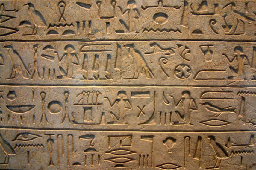
As one of the first and fundamental forms of communication, writing and typography trace their roots even back to the Upper Paleolithic times when cave paintings used symbols as a form of language. However, as the formal history says, writing has been developed by Sumerians around 3,500 B.C. As each civilization advanced, so their need for communication became more complex. From Egyptian hieroglyphics with symbols and ideograms to Ancient Greeks who used the alphabet created by Phoenicians, taken over by Romans afterwards. The Romans have also styled the Uppercase Alphabet, which we still use today.
Going over The Middle Ages which popularized illustrated manuscripts and calligraphy, focusing on the hand-written texts, we come to the most important point in the history of modern typography as we know it today – the invention of the moveable printing press in the 15th century, by Johannes Gutenberg. After this moment everything changed, books could be published and distributed on a large-scale, meaning that education could become more spread, the news could be created and read, as well as advertisements using the initial serif and sans serif typefaces. But how has writing evolved since then, how did typography become more than just a decorative element and turned into not just an important form of art, but also a language itself in our contemporary society?[1]
Early Modernist Typography – The Bauhaus Fonts
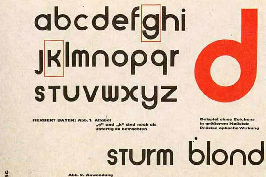
One of the last Bauhaus students, Herbert Bayer has definitely left a huge mark on not just typography, but also other forms of visual arts and architecture. He used and adopted the principles of reductive Minimalism to develop his famous Sans-serif type titled Universal, and it was one of the keys to defining the entire Bauhaus aesthetic. The aesthetics of the Bauhaus has influenced many important artists, among them Jan Tschichold, the man who created visual experiences on a subconscious level for all the book lovers, who could now see art in books even while only observing letters. After seeing a Bauhaus exhibition in 1924, he adopted the composition, structure and geometry of the Bauhaus, leaving behind his passion for black letters and scripts and adopting new rules. His most important work was Die Neue Typographie – The New Typography, published in 1928, as a masterpiece of the modern typography and graphic design. This book standardized typographic practices with a set of rules. This reflected a move towards a more universal and modern communication style.[2]
A Birth of Technology Tools and Pop Art
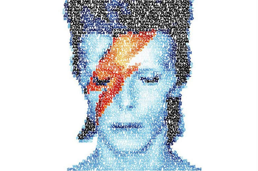
With the rise of technological capabilities, the capitalist society prospered from additional ways of creating new items and commercials, but also allowed artists to refer to and play with these new creations. The most important move which made a revolution in typography during the early 1950s was when Varityper and Photon each introduced a reasonably priced, standalone typesetting system. This also meant that both the producers of goods and artists can have more access to the production of typography. Pop Art emphasized the kitschy elements of popular culture and created art as a protest against the elitist culture and seriousness which surrounded it. Artists like Andy Warhol completely replicated both the forms of consumerist products, as well as the fonts used for their commercials. Roy Lichtenstein, on the other hand, integrated a simple, comic book text font as a part of his famous large-scale paintings. Known as one of the most important pioneers of contemporary Typographic art influenced by Pop art, British artist Mike Edwards created and creates Word Paintings or Text Portraits in which each letter becomes rendered in a separate color. When the image is viewed from distance, the letters merge together and create a photographic quality of the work.
Be sure to check out works by Andy Warhol on our marketplace!
Typography as a Messenger of Peace in the 1960s Design
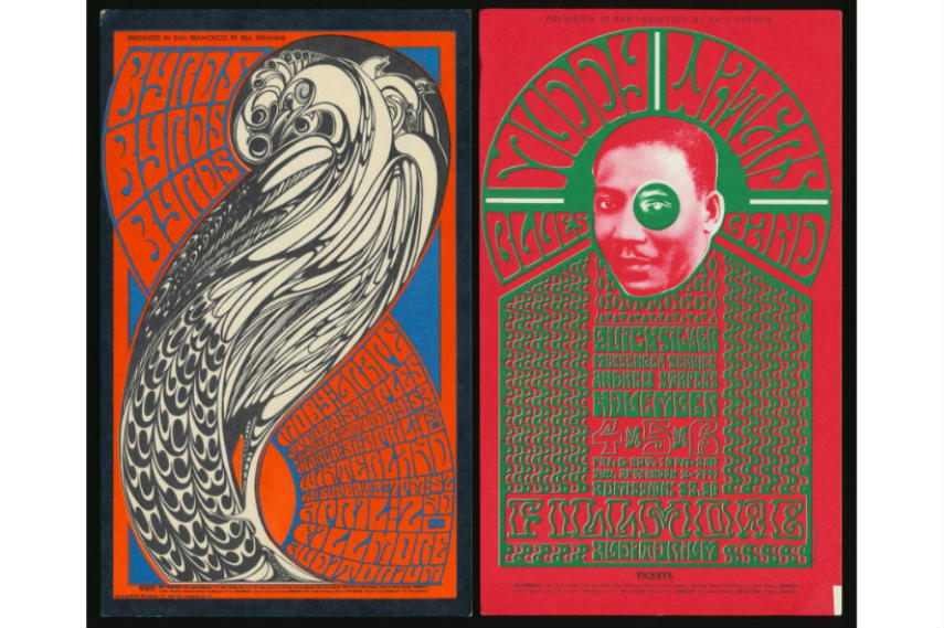
As the 1960s were times of radical social changes, with the beginning of the peace movement and the psychedelic era, with it came new fonts and designs which were created to support the innovative ideas flourishing at those times. One of the most important designers of psychedelic posters was Wes Wilson, who heavily influenced typography by inventing a new font around 1966, which became synonymous with the era. It was the psychedelic font which made the letters become more dynamic and look like they are melting away from the prints. Typography was used as a way of spreading ideas about the ongoing social changes, protests and ways of adopting a new lifestyle. One of the key designers who also played an important role with his color experiments was Victor Moscoso, who used the concept of vibrating colors on his typographic posters, created by taking colors from the opposite end of the color wheel, with equal value and intensity.
Between Tradition and Software Development in the 1970s and 80s
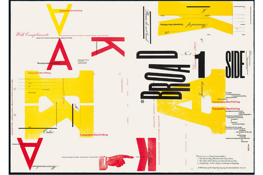
Concerning the technology of the 1970s, it included the invention of third-generation typesetters which used electronically stored font data. Through the early ’80s, these machines were the most important producers in the printing and publishing industry. The bubbly, futuristic, colorful letters on album and book covers during these times remain an important inspirational point for artists even today, who try to copy the genuine retro fonts like Baskerville OF, Bubble Gum, or Futura. But even though many artists and designers of the time found inspiration in the software development, others tried to renew traditional forms and to find different ways of applying them. In 1989, the true master of traditional typography and printmaking, and a multidisciplinary artist, Alan Kitching, established The Typography Workshop, a studio that uses traditional techniques of letterpress printing but also combines them with obsolete technologies and seeks new ways to apply them. The result becomes magical and can be seen through his innovative, colorful works which use wood and metal, but show how even these traditional materials can be inspiring.
Contemporary Typography Design
As always, contemporary artists have been redefining and transcending traditional practices and procedures of typewriting with the help of technology and multimedia design tools. The contemporary typography works, in the spirit of postmodernism, include and combine everything from Neo-Pop, contemporary calligraphy, filmmaking, installation art, sculpture and street art. Some of the notable artists working with this style today is definitely Craig Redman, who uses his iPhone, camera, laptop and Photoshop to create simple cynical messages presented in an optimistic, simple, form-reducing manner. Like many other artists working with typography, his work doesn't stop with clients but he also enjoys creating messages of his own. Starting as a graffiti artist who fell in love with calligraphy, Luca Barcellona combines ancient tradition with contemporary design and creates live calligraphy exhibitions. His works question the possibility of words becoming a graphic interpretation of the text, and the most important piece in this series was his graphic reinterpretation of a story by Franz Kafka.
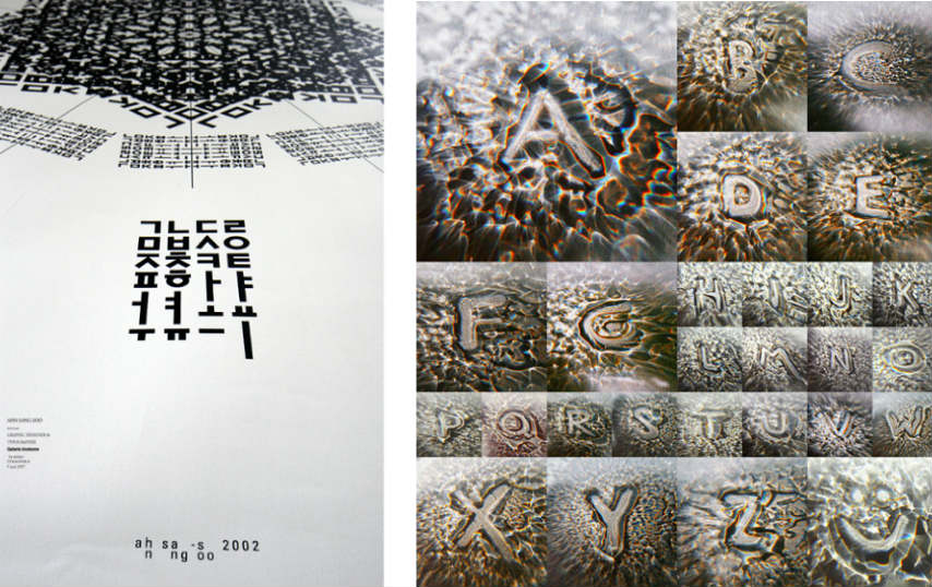
On the other hand, even traditional alphabets like Hangul get reinterpreted in contemporary typography of Ahn Sang-Soo who transformed this ancient alphabet into an artform of its own. Rus Khasanov is another important contemporary artist who uses items like laptop screens and soy sauce to create his typefaces. A prolific graphic artist known for creating typographic installations which move the boundaries of this art even further, Oded Ezer makes projects which include implanting type into sperm's DNA, doing Typo-plastic surgeries to modify our body using type, and makes creatures out of Hebrew and Latin type.[4]
Contemporary Calligraphy and Typography in Street Art
Since its very beginnings, the fonts used in graffiti made up the essential quality of this art form, used to create an important style distinction between different artists and groups. For an example, the famous pioneer of New York street art, Cope2 became world-known for his recognizable bubbly font tags. More recently, the German street artist Bronco became internationally known for having a consistent typography which he combines with a sharp sense of humor that criticizes and questions the pop-culture and politics, but also our everyday life experiences. Another socially engaged typography street artist known for his humor is the famous Max Rippon, or RIPO, who creates clever and highly stylized works which put words into visual landscapes and images into words, exploring the impact of textual communication through language, forms, and symbols.
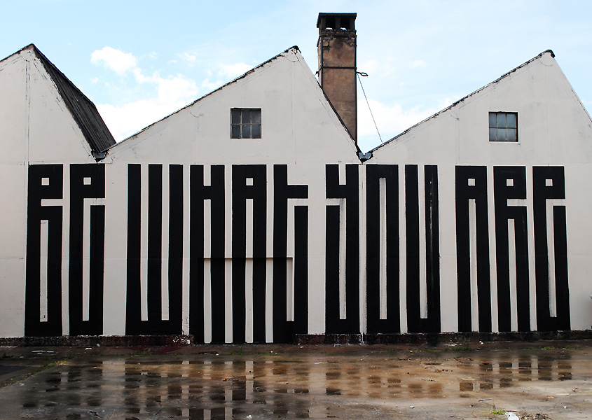
The French street artist L'ATLAS comments on the displacement of people through his famous rigid forms and lines which take calligraphy as an inspiration for even creating large-scale installations in cities, which show that borders between people but also art forms only exist within our minds. The British artist Dean Zeus Colman creates fusions between graffiti, typography, sculpture and fine art in his 3D works, which explore the life of letters outside of their usual boundaries set by street walls. Finally, Retna is an artist who went so far away in street art innovations within typography that he completely invented his own distinctive, constructed script which he now uses as part of all artworks he produces. Typography definitely was and continues being a tool for transforming and reviving graffiti and street art styles and practices.
The Power of Lettering
The evolution of typography seems to be bringing it back to its own roots; just like in the times of cave paintings, when it was all about having the symbols within the spaces you inhabit, it seems to be going out to the streets again, occupying walls and delivering messages. Contemporary artists are at the same time developing new techniques with the help of sophisticated technology, but are also looking back into the past for inspiration, all the way to the ancient civilizations from which they take early symbols and refill them with new meanings. Typography is inevitably not just a part of the visual imagery, but is a language for itself, an art form for itself, which shows perfectly the dichotomy between the meaning and the expressive form of any language.
Editors’ Tip: Type: A Visual History of Typefaces & Graphic Styles
This compact yet comprehensive book offers a thorough overview of typeface design from 1628 to the mid-20th century. Derived from a distinguished Dutch collection, a series of exquisitely designed catalogs trace the evolution of the printed letter via specimens in roman, italic, bold, semi-bold, narrow, and broad fonts. Borders, ornaments, initial letters, and decorations are also included, along with lithographic examples, letters by sign writers, inscription carvers, and calligraphers. The first part of the book covers pre-20th century typeface, with texts by editor Cees de Jong and collector Jan Tholenaar. The second part covers the period from 1900 to the mid-20th century, and contains a historical outline by Alston W. Purvis.
References:
- David Diringer, The Book Before Printing: Ancient, Medieval and Oriental (Lettering, Calligraphy, Typography), Dover Publications; New York, 2011
- Cees W. De Jong, Type: A Visual History of Typefaces & Graphic Styles, TASCHEN, 2007
- Sarah Skrilloff, A Brief History of Typography, Ashworth Creative [March 28, 2017]
Featured image: Retna - Bottom Line is Red, Rus Khasanov - Typography for Fortune Detail, Rus Khasanov - Typography for Fortune Detail, Jan Tschichold - Design Is History, Mike Edwards - Word Portrait of Edie Segwick, Oded Ezer - Contemporary Hebrew Typography, Max Rippon - Domestic Violence 2014. All images used for illustrative purposes only.
Can We Help?
Have a question or a technical issue? Want to learn more about our services to art dealers? Let us know and you'll hear from us within the next 24 hours.

