
Remember these beautiful hand-drawn elevations that your architect grandpa used to draw? How much hierarchy and subtlety they had? The attention to details, the trees, the whole family strolling around the building, just enjoying life? They were not just elevations, they were work of art.
Of course, the BIM process completely sucked out the life out of these drawings and gave us efficient, but boring elevations. But does it have to be this way ? Of course not. While we might not capture the same magic as before, a couple of steps and help from new features in Revit 2017 can help put some charm back into elevations.
Let's take a random Revit project, say this super secret research facility. Here is what it looks like in 3D.

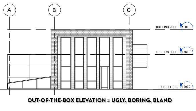
What happens when we make a default elevation of this building ? We got a boring out-of-the-box graphics elevation. Don't tolerate this. You have to make this elevation as exciting as you can. Here are the 3 basic tools that will help you achieve this goal.
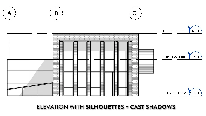
1- SILHOUETTES
Access the Graphic Display Options by clicking the cube next to the sun icon on the view control bar. Set the Silhouettes to a linetype of medium width. I recommend Medium Lines, so between 0.3mm and 0.5mm.


2- CAST SHADOWS
Cast shadows immediately give your elevation a sense of depth. However, the default setting is too dark. Click Lighting on the graphic display option menu and set Shadows to 15 instead of 80. This makes the effect more subtle and easier for the eyes.

3- DEPTH CUEING
New from Revit 2017, this tool fades elements based on their distance. You need to control each view individually with the Fade settings to get a decent effect.


GREAT REVIT ELEVATIONS FAQ:
WHY NOT USE LINEWORKS?
This great post from the Revit Kid showcases how to use Lineworks to get proper depth effect. This is a good technique if you have a lot of time and want the "perfect" elevation, but I would rather use Silhouettes since they can be included in a View Template and applied to every elevation in a single click. Also, Lineworks is not compatible with Depth Cueing. Using lineworks on a faded line will turn it black and remove the depth effect.
SHOULD I USE AMBIENT SHADOWS?
Ambient shadows can be fun for presentation drawings or when using colored elevations. The problem is you can’t control the intensity of the effect, and it looks way too intense when using black and white visual style (see image below). Most of the time you should leave them off to avoid areas that are too dark in construction documents.

WHAT ABOUT COLORS?
If you are making elevations for construction documents, leave them off and use Hidden Line visual style. Most plotters print in black and white. Colors will only add confusion. If you want elevations for presentation, then yes, you should use Consistent Colors visual style.

The example above includes the 3 basic steps, but also add Consistent Colors and Ambient Shadows. It looks quite nice for presentation views, but black and white is probably better for your construction documents.
You liked this tutorial ? Try our brand new edition of Revit Pure Pamphlets. It contains 16 pages of tips and tricks to help master Schedules. Pamphlets are sent 4 times a year by email, no spam. You will receive the entire pamphlets collection
