

BY ROB
A by-product of being an expansion team in any sporting league is that the teams that have been in the competition for years (i.e. the best part of a century) have taken all the regular colours for their jerseys. As the new kid, you have to pick from the unwanted crayons in the tin.
Amongst expansion teams in Australian sport there is an abundance of purple (Melbourne Storm and Fremantle Dockers), teal (Port Adelaide Power) and orange (GWS Giants).
The Canberra Raiders entered the NSWRL competition in 1982 adorned in an eye catching lime green strip. The original jersey was designed by local Patricia Taylor, who had won a competition. Like the other teams playing in the modern NRL the Raiders have undergone many design changes, some good, some average and some downright baffling. So without further ado, here is a chronological celebration of the mighty lime green jersey of the Green Machine.
1982
 Can you tell that they’re still only semi-professionals?
The Raiders original strip was the most pure incarnation of the clubs colours. Taylor’s choice of lime green was offset by the elbow striping, the blue and gold representing the ACT’s sporting colours. The shorts were a plain white with blue and gold trim, whilst the socks matched the jersey perfectly. The simple V neck collar was also of note, being much more sensible than the ghastly collared jerseys of the mid 1990s. The only signage found on the jersey was the NSWRL logo on the right and the Canberra Raiders original logo on the left.
1986
 The first premiership winning jumper!
By this point in time the jersey has had some noticeable changes made to it. The lime green had started to darken somewhat, while the size of both logos has almost doubled. The jersey now hosted one sponsor, Woodgers, a real estate firm that would remain with the Raiders until the end of their first premiership season in 1989 (incidentally the same year the company went bust).
1990
 Back to back!
Fast forward four years and we find the Green Machine with their second premiership. At this point the sponsorship had changed from Woodgers to Video Ezy, who were now also featured on the left sleeve. The right sleeve was home to the Winfield Cup logo. Interestingly, the prohibition on cigarette advertising now prevents the logo from appearing on replica jerseys (a tip and how to spot a genuine from a remake). The other notable change was the shift from white to blue on the collar, as well as on the sleeve cuffs.
1999
 Needs more green
The ill-fated Super league may have started and finished in 1997, but its supremely awful design was retained for years after. A mostly white jersey was adorned with jags of green which pales in comparison to the original lime or the shade change that the Raiders wore to three premierships. After extensive googling I still can’t decide if those blue downwards chevrons were part of the Oracle sponsor logo or some awful kind of stylised abdominal muscles. We now also entered the period of collared jerseys, which saw many a tackle made by the defence grabbing whatever piece of fabric was at hand and dragging their prey to ground. At least our socks were still good. Those with a keen eye will notice that the NSWRL logo was removed, replaced by the NRL shield.
2000
 Black shorts. Boooo
The 2000 vintage jersey is notable for some reasons: it was the first jersey to bear the Raiders updated logo, and it did somewhat erase the memory of the proceeding offensive strip. It was also very clearly a product of its time, especially in the sponsorship department – the OzEmail signage screams the early 2000s. The jersey also combined both of the more appealing Raiders greens, but it was diminished by the designers need to have lots of black, which muddles the team and NRL logos. The ACT blue and gold trim was also absent, and all these factors came together to form a playing kit somewhat devoid of energy.
2005
 Trippy.
Just let this image soak into your brain for a few moments – it’s very portentous/ominous. Here we have the 2005 squad all arms crossed tough guy style in front of an overcast background. Apocalyptic! Woolford appeared to be trying out his new gangsta footballer pose, whilst Croker was trying on his Martin Sachs impersonation. The jersey itself (which came in in 2003) at least had some positive changes – ACT trim had returned, and the monotonous black lines banished. The green itself was somewhat odd, best described as “Raiders Lime” (as in the milk). The Fone Zone logo kind of fit, but took up quite a lot of space, as well as having a slightly distracting shape. Meanwhile everyone was still sporting those bloody collars.
2008
 Mismatched sponsor.
Take a look at this picture. A good look. See the guy out of focus far left? Now look at the Raiders arm sponsor. There has possible never been a worse mismatch of player and sponsor in the team’s history. Which is funny, because all that aside the 2008 jersey was the starting point for the evolution of the modern Raiders strip. The CFMEU was the major sponsor, but they didn’t look too out of place due to the amount of white used. The green was now slowly trending back towards the 1994 hue, and reverted to minimalist collars in that classic blue tone. The jersey also sported an extra fourth logo beyond the team, league and manufacturer insignia – the centenary logo that sits above the NRL shield.
2012

This photo is important for three reasons: the new competition led design; the reverse sponsorship Cancer Council logo; and that dude with the most awesome football afro ever. Admittedly this is a snap of the SG ball team, but no one in first grade was sporting hair that good. This strip was the result of competition which yours truly entered (in hindsight my design was way too outlandish), and it’s probably one of the best designs from the last decade. The ACT coloured V worked well, and the green of choice was easy on the eyes. The Raiders were without a major sponsor this season, so they did the right thing and emblazoned their jersey with the Cancer Council logo, which actually fit quite well in the overall design scheme. The collars were shortened and returned to white.
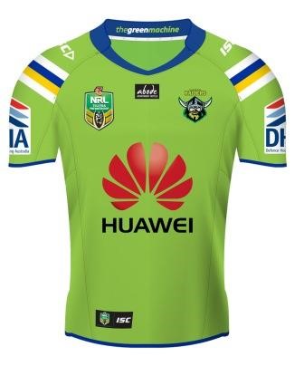
2014
 Josh! Sam! Focus!
2014 was a transitional year for the jersey, being the last year of the competition V style design and the third year of the giant red fan courtesy of the Huawei sponsorship. Many fans were somewhat unsure about the Huawei logo when it first appeared in 2012 (not to mention the strategic intentions of a Chinese company with an opaque ownership structure deemed too dodgy to access the NBN sponsoring the local team of Australia’s capital city), but a major sponsor is not to be sniffed at, and it was now a tolerable part of the design. Local Liquor was still amazingly the secondary sponsor on the arm, with Canberra Milk maintaining its spot on the shorts. The socks were somewhat ho-hum and the green itself was maybe a little bit too light, but the overall effect was reasonably neat and easy going.
2015
 Hot.
Hot.I’ve included the 2015 jersey as it marks another shift in the modern era. The V design is gone, with the ACT trim moving back to the arms, though this time round it is used higher up on the shoulders. The green has shifted strongly back towards the classic lime shade, and Local Liquor has finally been dethroned by Defence Housing Australia. ISC, the jersey manufacturer has been pushed to the bottom right by an Abode logo, but makes up for it by now also adorning the shoulders. The blue collars have returned and now run all the way round. Sleeve and torso trimmings are now in matching blue. Strangely enough the giant red fan fits even better with this design.
There are a stack of other jerseys that could’ve been covered – the sometimes ghastly away strips, the promotional/celebratory get ups and the out and out marketing ploys like the Hulk jersey.
I’m sure in the fullness of time we can examine many of them, and I hope you will join me to inspect those highs and lows of football fashion.

Great article. They have had some true shockers over the years, the 2000 one was the most baffling, is that kelly green? and black? don’t know what they were thinking. I wish they would go back to a basic design ala the Woodgers/Ezy/Milk era jerseys, really stick to a classic like The Roosters, The Rabbitoes or the Dragons, i have no idea why the NRL in general see’s it fit to update their jerseys every year. It seems every team in the AFL sticks to a staple design, and i really like that, it pays respect to the heritage of the game,
I also wish they would bring back the old patch, the new one does not look good (at all!) and most importantly, three premierships were one under the old patch, it has a history and allot of pride behind it. Its also a classic and simple design, i have no idea why they saw it necessary to update it, even though now, i think it is 15 years old, and 15 long years with allot of turmoil and disappointment behind it, egh.
Up the Milk!
LikeLike
Great article and a true walk down memory lane. Now, what I would give for the original jersey, I’m talking thousands (obviously in good nick though). Go the lime!
LikeLike
In 1988, living in Brisbane temporarily I watched the Raiders beat Brisbane. I spent hours looking for a Woodgers jersey & finally found one in a tiny sports store in the City. Unfortunately, it cost more than my rent money so couldn’t get it. The following year, my Mum gave me a McFadden jersey. I still have it.
LikeLike
I dugg some of you post as I cerebrated they were invaluable
very beneficial.
LikeLike